03 / Direction · Editorial Design
ARCADE Magazine
Editorial design for the Northwest design quarterly. Volume 26 and Volume 30 anniversary.
Overview
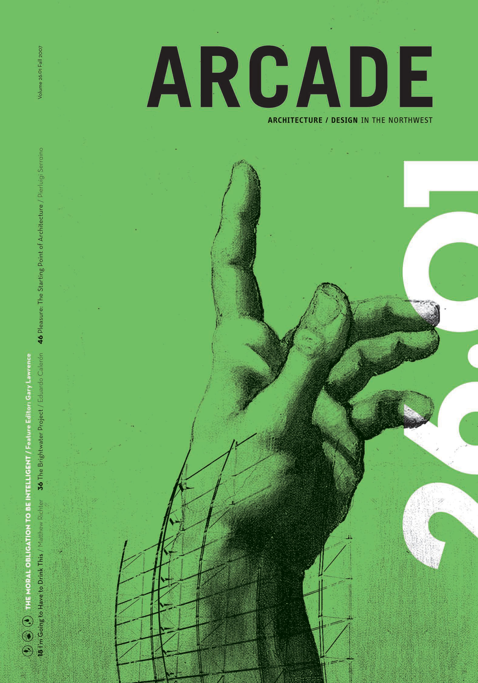
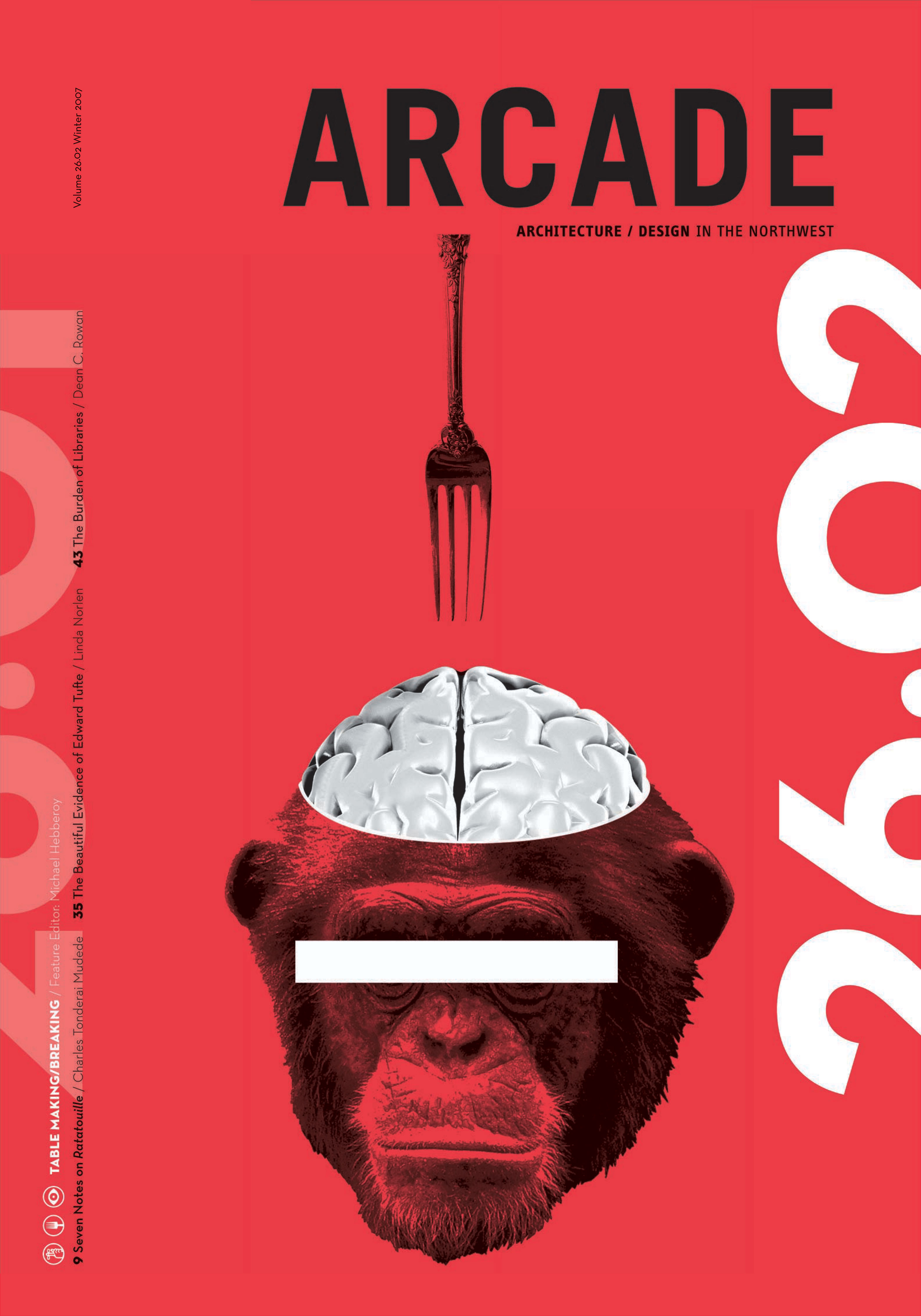
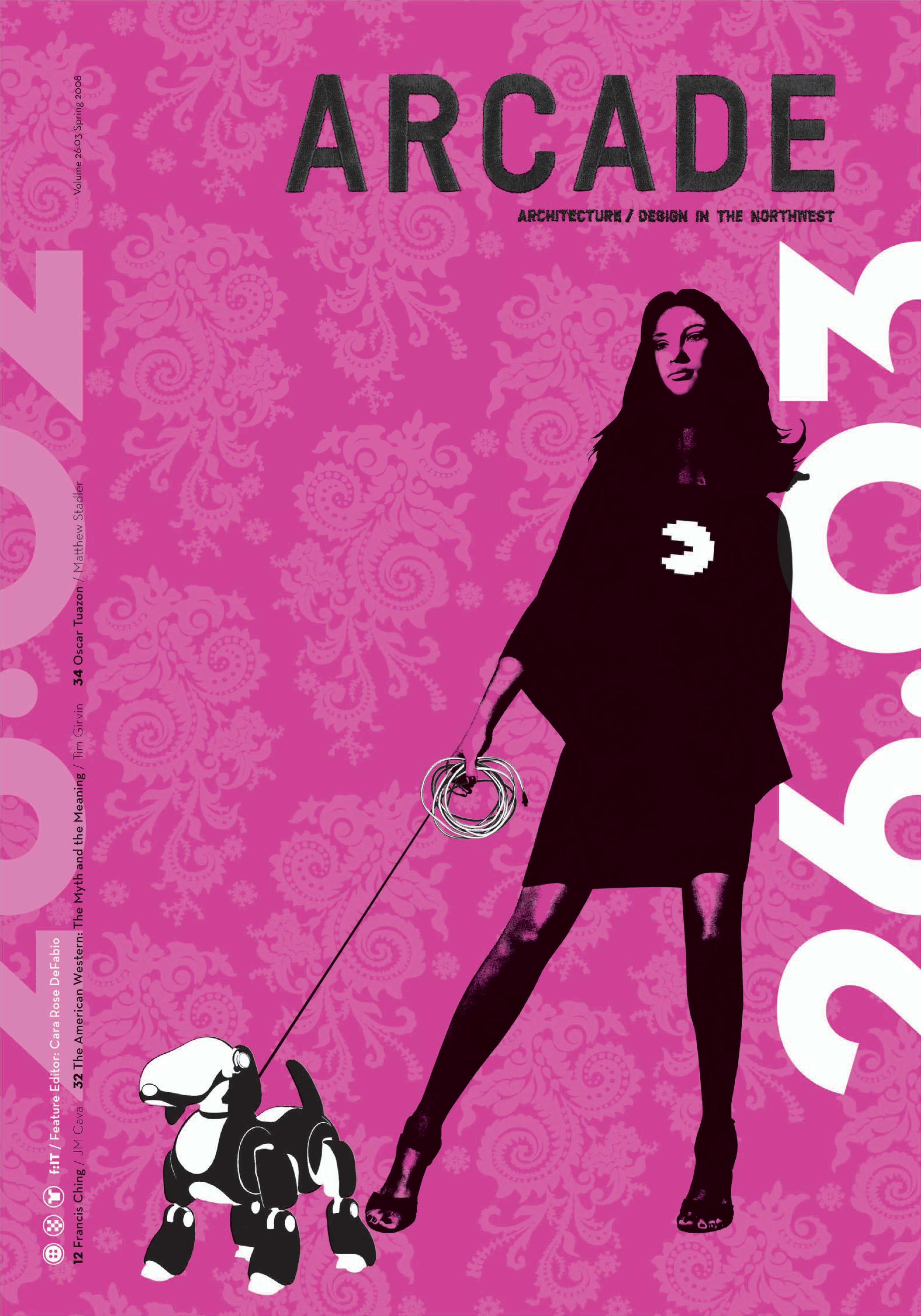
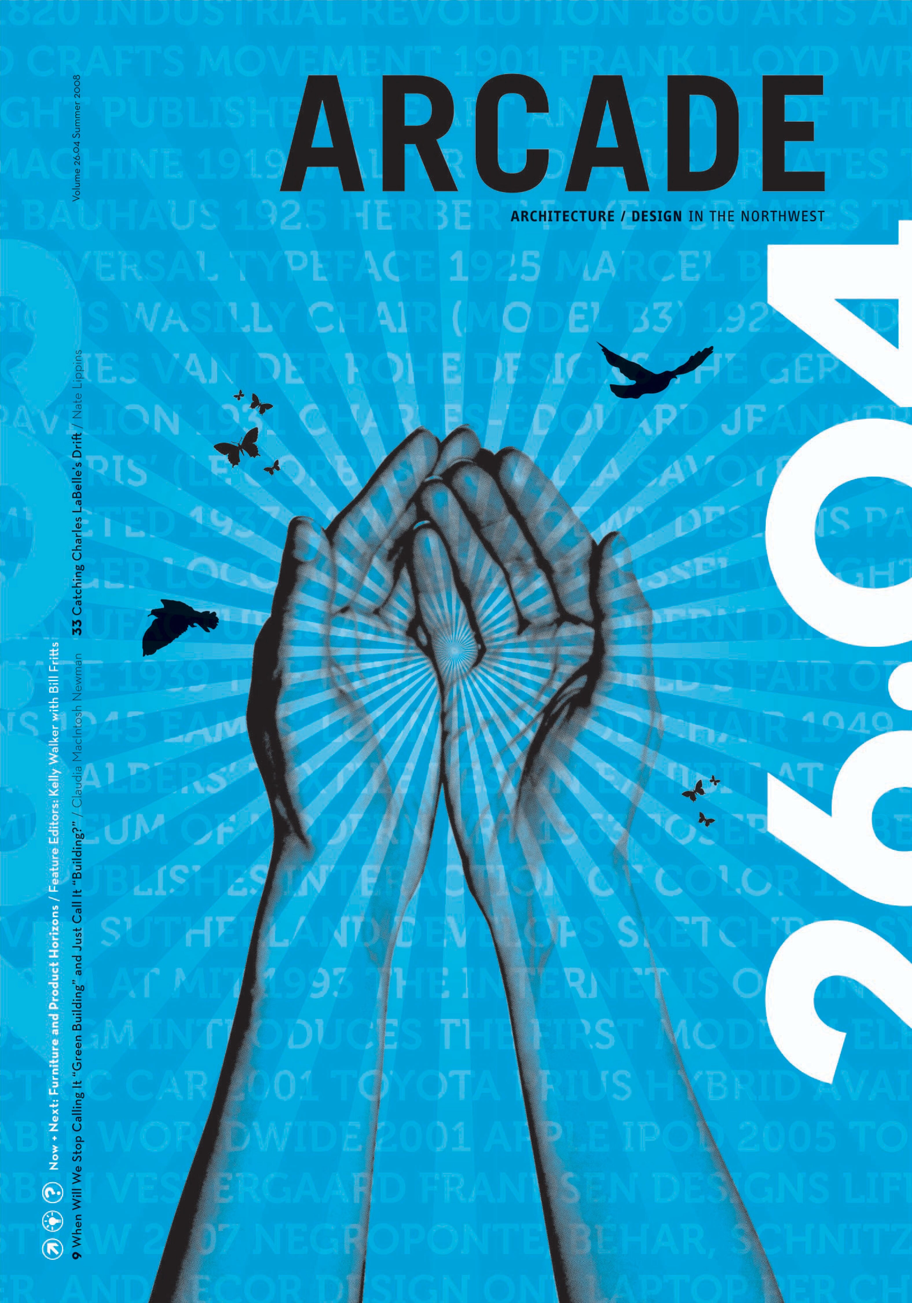
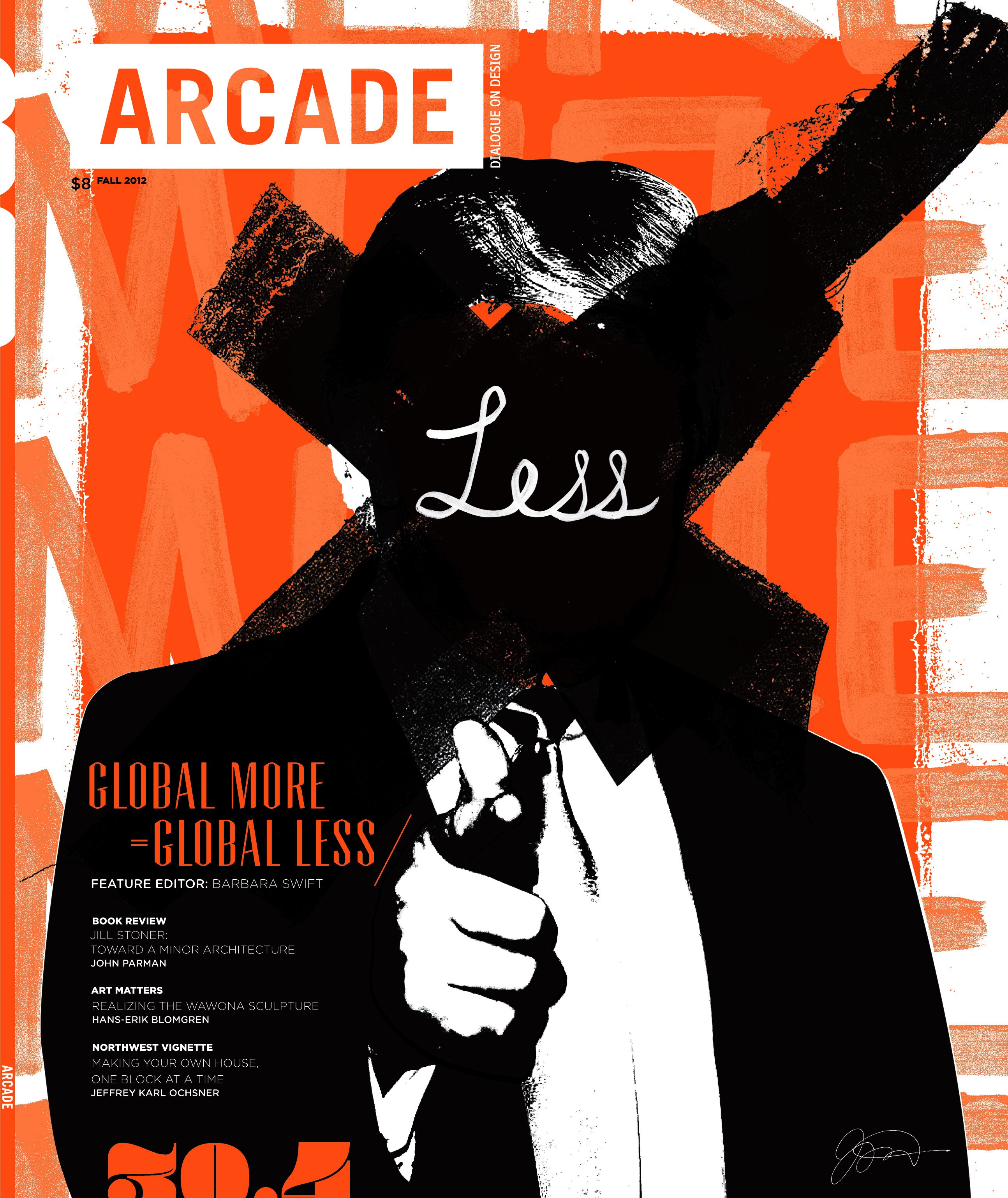
ARCADE Magazine is a Northwest institution focusing on architecture, city planning and design. Each year different designers are selected to create the issues and push the magazine to new visual heights. Stephanie Cooper and I were lucky enough to be selected for the 26th volume. I returned solo for the 30th-anniversary edition.
The challenge: a two-color press with the same visual impact as a four-color run. By the third issue we had the logo embroidered and were playing with bold textures and Pantone neon inks. One of my favorite projects.
Make It Personal
My buddy James Victore likes to say, “In the Universal lies the Particular.” When you speak of your truths and experiences, especially when shared with real emotion, you speak in a language people find relatable. These issues of ARCADE leaned personal, with little nuances and references throughout. Among the most popular the magazine has run.
Insights + Ah-Ha's
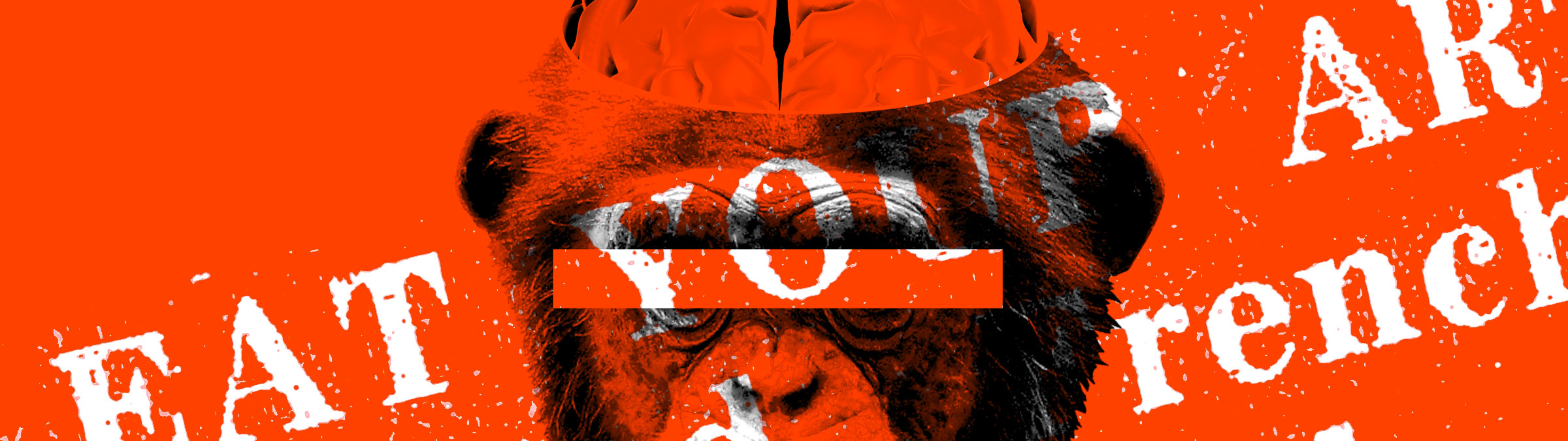
I went solo for the last edition in the 30th-anniversary volume. The visual provocation was a well-known public figure who, in my estimation, was and is the epitome of egomaniacal greed and reckless consumption in American pop culture. The work cut harder in 2012 than I expected and reads differently in 2026.
Channeling The Muse
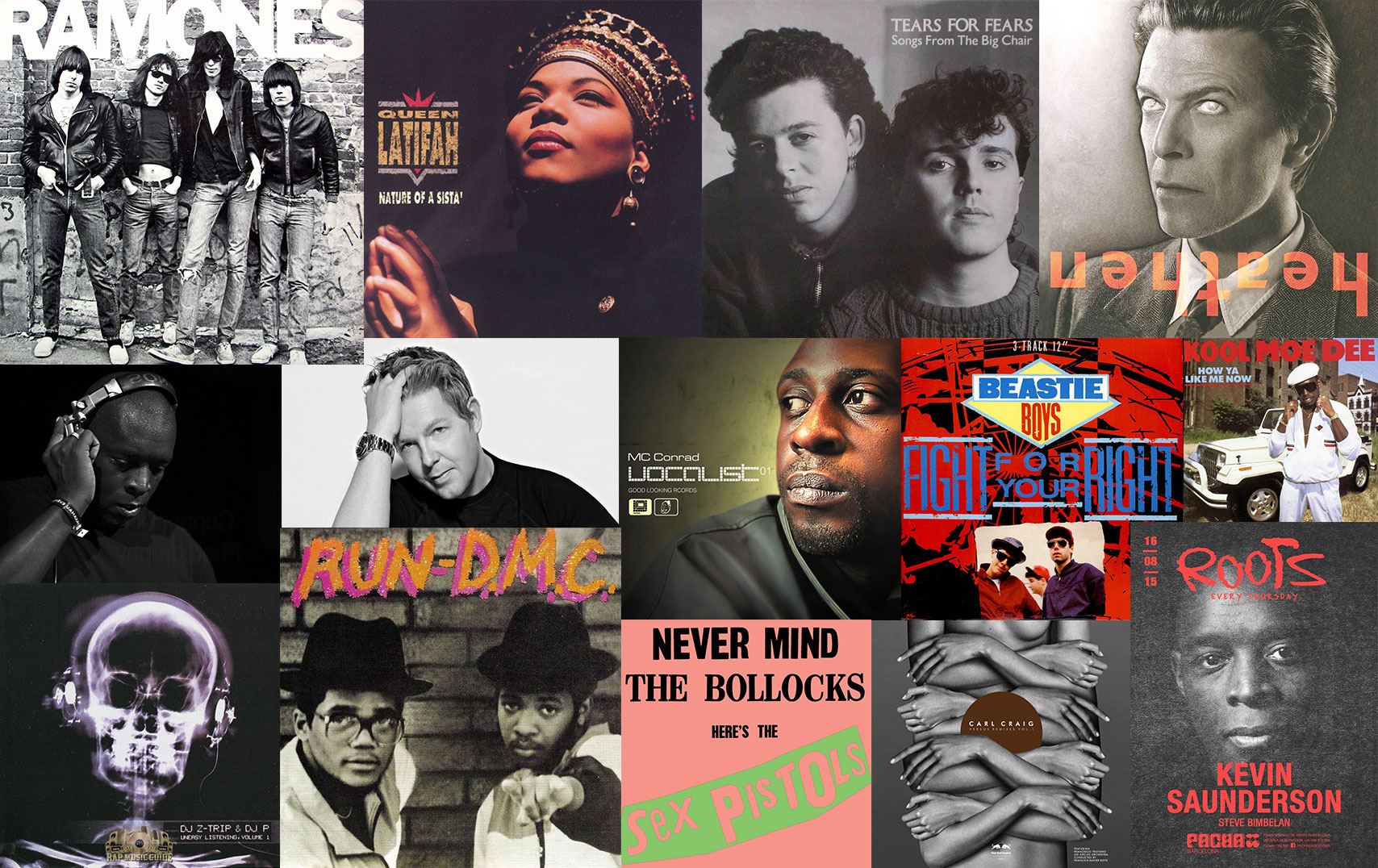
Volume 26 took a year across four issues. The 30th-anniversary edition came together in three months. Stretches of time between. Soundtrack ran wide: Dance and Detroit Techno to Bowie and the Beastie Boys. Punk, New Wave, Hip Hop. A mixed bag of audible inspiration.
Credits
- Editorial Design (Volume 26): with Stephanie Cooper
- Editorial Design (Volume 30 Anniversary)
- Client: NW Architectural League
- Years: 2007 and 2012